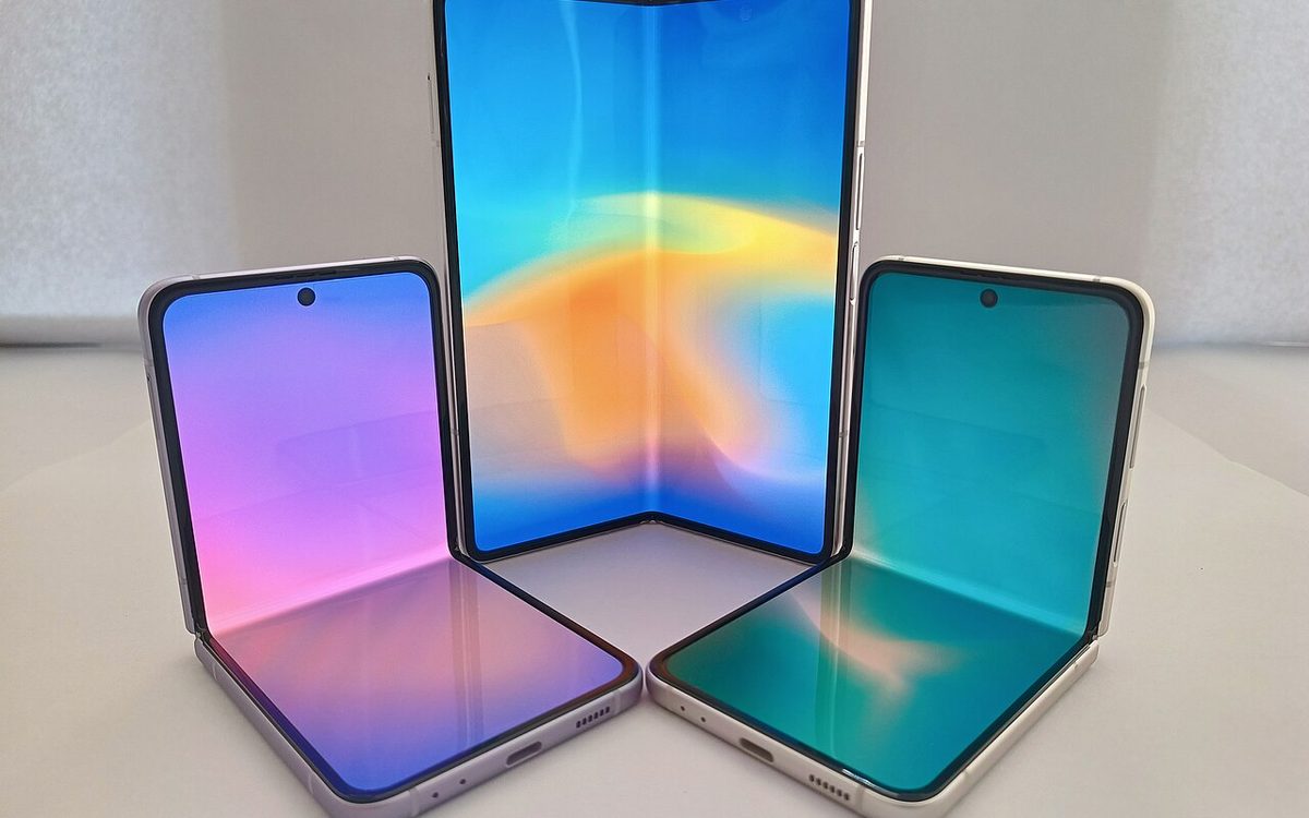
Apple's first foldable, iPhone Duo, went on sale on October 23, 2026, and every iPhone game on the App Store now runs on it, whether the developer planned for it or not. For Unity studios the work is less about the hinge and more about something older: your game's window can now change size and aspect ratio in the middle of a match. This guide covers what Unity has observed on the iPhone Duo simulator, what Apple asks for, and a practical checklist for getting a Unity mobile game ready before the April 2027 deadlines.
▶ Watch the video version (about 4 minutes):
What actually changed for games
iPhone Duo has a compact outer display and a large inner display. Unity's engineers describe the inner screen as close to 4:3, close to an iPad, while most phone games are designed around roughly 20:9 (Unity Discussions). When a player opens or closes the phone, the game moves between the two displays. On the inner display a game can also run side by side with another app, and Unity notes there is no way to opt out of that.
Apple's Prepare for iPhone Duo page sums up the risk: apps built with the iOS 27 SDK and later resize dynamically, and "hardcoded screen sizes, fixed orientations, and device assumptions can break layouts, leading to stretched, clipped, or misplaced content." For a Unity game that usually means three things:
Screen.widthandScreen.heightare no longer fixed for a session.- The safe area is different on each display, and not symmetric.
- On the inner display, iOS treats your game much like an iPad app.
The dates matter too. Apple opened iPhone Duo submissions on October 5 and says that from April 2027 every app or game submitted must include iPhone Duo screenshots. Unity also expects Apple to require the iOS 27 SDK for all submissions by late April 2027, in line with previous years.
How the SDK you build with changes the result
You do not need to do anything for your game to launch on iPhone Duo. What you get depends on the Xcode SDK used to build it. Apple describes three tiers, and Unity's team tested each on the simulator:
| Built with | What players see (per Apple and Unity) |
|---|---|
| iOS 26 SDK or earlier | "Full legacy mode": the window keeps a normal iPhone size, black space around it |
| iOS 27.0 SDK | "Partial legacy mode": window 240 px shorter on one side, black bar; runtime orientation changes don't work |
| iOS 27.1 SDK or later | Fills the whole display on both screens; the game must handle resizing |
The middle row is the one to avoid. With SDK 27.0, Unity observed that orientation is locked to what is set in the Xcode project and that forcing an orientation at runtime does nothing. If your game switches between portrait menus and landscape gameplay, that is a real bug, not a cosmetic one. Apple's advice is to recompile with Xcode 27.1, which adds iPhone Duo development support.
The "Requires Full Screen" setting is no longer an escape hatch
Many Unity mobile games tick Requires Full Screen in iOS Player Settings to avoid iPad multitasking. That checkbox maps to Apple's UIRequiresFullScreen key, which Apple deprecated in iPadOS 26. Unity's post explains what it still does on iPhone Duo with SDK 27.1:
- Disabled: on the inner display the game rotates freely and fills the screen; runtime orientation changes do not work there. Side by side, it fills half the screen.
- Enabled: the game keeps its allowed orientations and runtime changes work, but if the player rotates the phone to an orientation you don't allow, iOS draws black letterboxing around the game.
On the outer display both settings behave like a normal iPhone. Unity's warning is the key point: because the key is deprecated, Apple can change its behaviour without notice. Treat it as a temporary bridge, not a design decision. The same post notes that on iPadOS 27 every Unity game built with SDK 27 is opted into Split View and Stage Manager resizing, with no exemption announced for games, so the work you do for the Duo also fixes iPad.
Handle resolution changes mid-session
The good news from Unity: the rendered view adapts to the new window size automatically, and both uGUI and UI Toolkit support layouts that react to size changes. The bad news is everything your own code caches. Typical offenders in our projects are:
- Camera viewport rects or orthographic sizes computed once in
Start(). - Render textures sized from the screen (minimaps, outlines, UI blur).
- Virtual joystick zones and swipe thresholds stored in pixels.
- Canvas Scaler set to "Match Width" only, which looks fine on 20:9 and squeezes the HUD on 4:3.
Unity's guidance is simple: screen width and height update in real time with the window, so poll them and rebuild whatever depends on them. A small component that watches both size and safe area covers most cases:
using UnityEngine;

public class SafeAreaFitter : MonoBehaviour
{
    RectTransform rt; Rect lastSafe; Vector2Int lastSize;

    void Awake() { rt = GetComponent<RectTransform>(); Apply(); }

    void Update()
    {
        if (Screen.safeArea != lastSafe ||
            Screen.width != lastSize.x || Screen.height != lastSize.y)
            Apply();
    }

    void Apply()
    {
        lastSafe = Screen.safeArea;
        lastSize = new Vector2Int(Screen.width, Screen.height);
        Vector2 min = lastSafe.position, max = lastSafe.position + lastSafe.size;
        min.x /= Screen.width; min.y /= Screen.height;
        max.x /= Screen.width; max.y /= Screen.height;
        rt.anchorMin = min; rt.anchorMax = max;
    }
}
Put it on a full-screen panel under your Canvas and parent the HUD to it. Fire the same "size changed" event to cameras, render textures and input zones rather than giving each its own check. For the Canvas Scaler, a "Match" value around 0.5, or switching the match value by aspect ratio, keeps buttons readable on both a tall outer screen and a nearly square inner one.
If a scene really cannot adapt (a fixed-board puzzle, a pixel-art game), Unity suggests adding your own letterbox or pillarbox inside the app so the aspect ratio stays fixed. Put artwork in the bars instead of plain black; it looks deliberate.
Safe areas, the camera side and the fold
On the outer display the safe area excludes the home bar at the bottom and the side with the selfie camera, where native apps place their vertical toolbars. On the inner display only the bottom is excluded. Unity reports the new safe area out of the box through 0, so the component above handles it, as long as you use the rect itself rather than deriving one margin and applying it to both sides. Remember the origin is bottom-left; UI Toolkit needs the y axis inverted, as the Unity docs show.
Unity says you should decide whether the side exclusion matters for your game. Backgrounds and the playfield can run edge to edge; buttons, timers and currency counters should stay inside.
The fold itself is a separate concept. Apple's iPhone Duo documentation calls it a reserved region: a "division" that is active when the phone is partially folded and inactive when fully open, read with reservedRegions(kind:options:) in UIKit or SwiftUI. We have not found a Unity C# API for it, so reading the fold today means a small native iOS plugin. For most games the practical rule is cheaper: keep critical HUD and touch targets away from the middle of the inner display, where the fold sits.
Known issues and what Unity is still testing
Unity's post is marked as live and based on the simulator, so expect updates. One known issue is listed: Unity reports 489 DPI on both displays, while the outer screen runs at 430 DPI and the inner at 460. If you use Screen.dpi to size touch targets or drag thresholds, add a sanity clamp or test on hardware.
Also test fold and unfold during active play, not only from a menu. Many games pause in OnApplicationPause or stop audio on focus loss; check that a fold mid-match does not leave the game frozen, double-paused, or with music muted when it comes back.
Is it worth more than the minimum?
Apple's App Store editors picked 20 "Great games on iPhone Duo", and Mobilegamer.biz found that most come from small studios and solo developers, with only three big mobile publishers in the list (Gameloft's Asphalt Legends, Miniclip's 8 Ball Pool and Rovio's Angry Birds Dream Blast). The device starts at $1,999, so the audience is small for now. On the other side, Azra Games describes on the Unity blog how its RPG UnGodly, built on Unity 6.3 LTS with URP, adapts to folded and unfolded states and runs at up to 60 fps on iPhone Duo, while the team is still extending dual-orientation support across its interface. Even a large team is shipping this in stages.
When you upload iPhone Duo screenshots, Apple shows a badge on your product page saying the app is optimized for iPhone Duo, and you can mention Duo support in a featuring nomination in App Store Connect. For a small studio, an early, clean Duo version is one of the few cheap ways to get in front of editors this year.
Checklist for a Unity mobile game
- Install Xcode 27.1 and build your current release with it. Skip SDK 27.0 builds for production.
- Decide on Requires Full Screen per game. Turn it off if the game can rotate and resize; keep it only as a short-term bridge.
- Run the iPhone Duo simulator in Device Hub: outer display, inner display, side by side, every pose. Also try the resizable simulator and iPhone Mirroring on macOS 27 at extreme window sizes, as Apple suggests.
- Add one "screen size changed" event and rebuild cameras, render textures, input zones and HUD on it.
- Apply
Screen.safeAreaas a rect, check the camera side on the outer display, and keep HUD out of the fold area. - Check
Screen.dpi-based sizing against the known 489 DPI issue. - Fold and unfold during gameplay, ads and purchases; confirm pause, audio and ad callbacks recover.
- Capture iPhone Duo screenshots now, before the April 2027 requirement.
Our take
At Lightning Studio we build casual Unity games for English-speaking markets, and our layouts were designed for tall phones. The iPhone Duo work turned out to be the same work iPadOS 27 already forces on us: stop caching the screen size and treat the safe area as a rect. We are moving our games to Xcode 27.1 builds with a single resize event and a safe-area panel, keeping Requires Full Screen on only where a board layout cannot stretch, and we will not build hinge-specific features until the install base justifies it. If you do only one thing this month, build with 27.1 and play a full level while folding and unfolding the simulator.
Sources
- Unity Discussions: iPadOS 27 & SDK 27 adaptability changes & iPhone Duo updates
- Apple Developer: Three steps to make your app shine on iPhone Duo
- Apple Developer News: Prepare and submit your apps for iPhone Duo (October 5, 2026)
- Apple Developer Documentation: Preparing your app for iPhone Duo
- Apple TN3192: Migrating from the deprecated UIRequiresFullScreen key
- Unity Scripting API: Screen.safeArea
- Mobilegamer.biz: Who's making games for iPhone Duo? Mostly indies, for now
- Unity Blog: Building a console-like mobile RPG in Unity (UnGodly)
Want to see how we build casual Unity games that work on every screen? Play our games and follow our updates at Lightning Games.
Cover photo: Foldable Smartphones by Ka Kit Pang, CC BY 3.0, via Wikimedia Commons (cropped).
Related posts
The First $1M in 2026: What 158 Mobile Games Teach Small Studios
AppMagic tracked 158 new 2026 mobile games to $1M. Puzzle games took 126 days but earned the most. Here is what the data means for your launch plan.

Unity's Official AI Agent Plugin: A Practical Guide for Mobile Teams
Unity now ships official skills for Claude Code, Codex, Grok and Copilot CLI. What is inside, how to install it, and where it helps a mobile game team.
Built-In Render Pipeline Ends in Unity 7: Move Mobile Games to URP
Unity 7 drops the Built-In Render Pipeline. Here is when to migrate a mobile game to URP, what the 6.7 wizard converts, and how to get the look and frame rate back.